Creating a cohesive home design style requires a clear vision and consistent choices across spaces. The key is to select a unifying theme or color palette and apply it thoughtfully throughout the home. This approach helps different rooms feel connected without becoming visually monotonous.
They should pay attention to elements like textures, finishes, and furniture styles to maintain balance. Mixing too many distinct styles can cause a disjointed look, while subtle variations within a chosen style add interest and depth.
Achieving harmony doesn’t mean matching everything exactly, but rather creating a flow where each space complements the next. Understanding these principles is essential for anyone aiming to design a home that feels unified and intentional.
Defining Your Home’s Design Identity
Creating a unified look starts with clear decisions about style and direction. These choices ensure the home’s interior design maintains cohesion across rooms, furniture, and décor.
Determining Your Personal Style
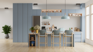
Identifying personal style requires examining preferences in colors, materials, and overall aesthetics. Common styles include minimalist, industrial, traditional, and Scandinavian. Recognizing which styles resonate helps narrow down design choices.
Practical steps include gathering inspiration from magazines or digital platforms. Creating a mood board with textures, colors, and furniture ideas solidifies a clear vision.
This process avoids random purchases and scattered design elements, establishing a consistent foundation. The style should feel authentic and functional for everyday living.
Setting a Consistent Design Direction
Once the style is clear, defining consistent design parameters is crucial. This can include choosing a color palette of 2-3 primary colors and selecting complementary textures, such as wood, metal, or fabric.
Consistency applies to furniture scale, window treatments, and even lighting styles. Keeping these elements aligned prevents visual clutter and supports a cohesive home design.
Documenting the direction through sketches or notes keeps decisions focused. It reduces the risk of mixing incompatible items that disrupt the harmony of the space.
Working with an Interior Designer
An interior designer offers expert guidance to maintain cohesion throughout a home. They assess the existing structure, lifestyles, and preferences to craft a unified look.
Designers manage color schemes, furniture layouts, and decor selection, ensuring all elements work in harmony. Their experience reduces costly mistakes and improves design efficiency.
Hiring a professional is especially helpful for complex projects or when personal style feels unclear. Collaboration with an interior designer supports informed choices, blending creativity with functionality.
Establishing Cohesion Through Color and Materials
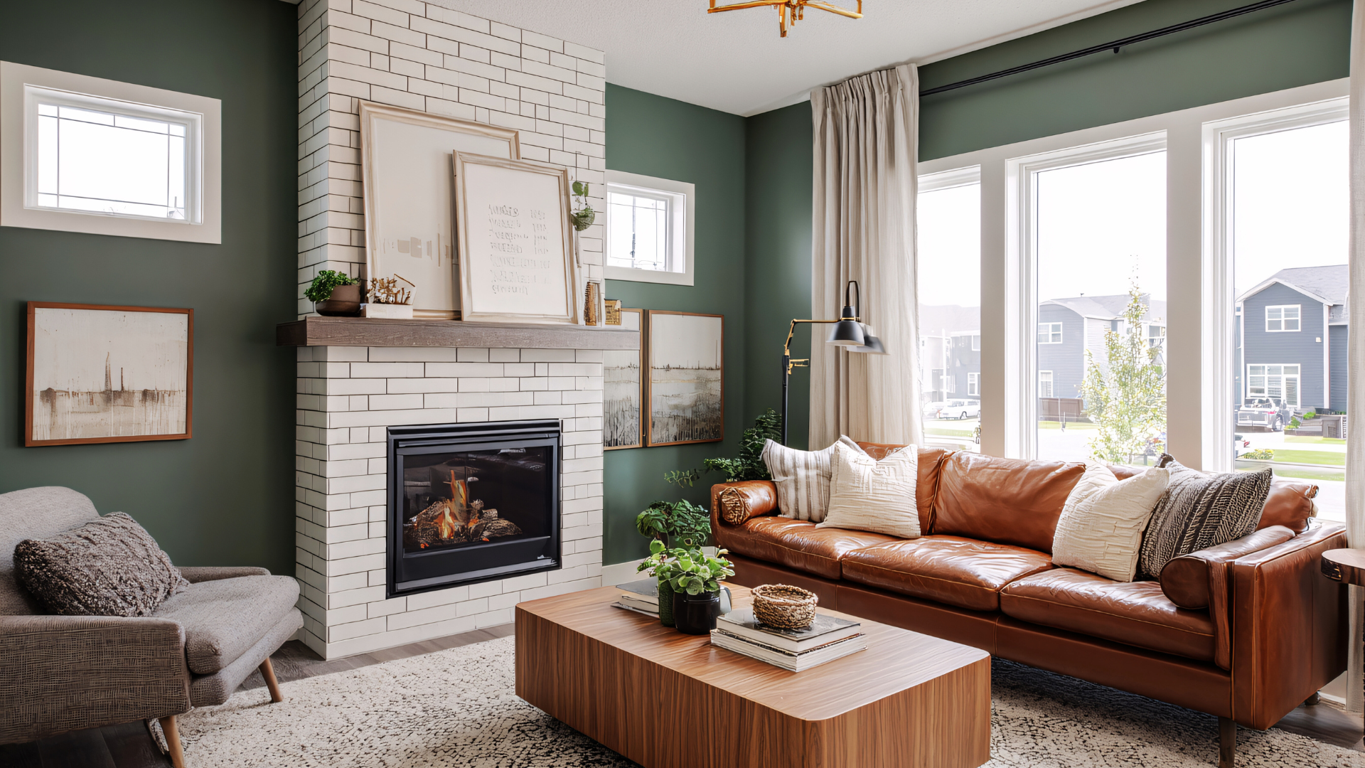
Creating harmony in home design depends heavily on the consistent use of colors and materials. Thoughtful color choices combined with repeated wood tones and finishes build visual flow. Accent colors and natural elements add depth while maintaining unity.
Choosing a Coordinated Color Palette
A coordinated color palette should anchor the entire space with a base of two to three main colors. These base colors appear on walls, large furniture, or flooring. They set the tone and create harmony.
Secondary and tertiary colors can be introduced, but must complement the base. Using color wheel principles, such as analogous or complementary schemes, helps keep these accents balanced. Avoid overloading the palette to prevent visual chaos.
Testing paint samples or fabric swatches helps confirm that colors work well together under your space’s lighting conditions. This ensures consistency throughout rooms.
Repeating Wood Tones and Finishes
Repeating natural wood tones in furniture, flooring, and trim connects different rooms visually. It is important to choose wood finishes that complement rather than clash.
For example, mixing warm oak flooring with cool gray-stained cabinetry can disrupt flow. Matching wood tones or selecting finishes within the same temperature range strengthens cohesion.
Matte and semi-gloss finishes are commonly used to balance warmth and reflectivity. A consistent finish type across wood elements avoids a patchy appearance.
Selecting Complementary Accent Colors
Accent colors add personality but must support the primary palette. They should appear in small, repeatable doses like pillows, artwork, or rugs.
A good strategy is to pick one or two accent colors that are either hues from the main palette or complementary shades on the color wheel. This maintains interest without overwhelming.
Incorporating metallic accents such as brass or matte black can also work as complementary colors, particularly when balanced with softer tones.
Integrating Warm Tones and Natural Materials
Warm tones and natural materials like wood, stone, and fabrics enhance cohesion by adding organic texture and color. These elements bring warmth and soften otherwise flat designs.
Using textiles in earth tones, such as rust, tan, or olive, ties back to wood finishes while adding variety. Natural materials also contrast well with painted surfaces, preventing a sterile look.
Consistent use of natural fibers, like jute rugs or linen curtains, integrates warmth and reinforces the home’s color story.
Achieving Flow With Furnishings and Textiles
Creating harmony in a home involves deliberate choices in furniture, rugs, and accessories. Repetition of styles, textures, and patterns helps tie rooms together, while thoughtful coordination ensures smooth transitions between spaces.
Selecting Consistent Furniture Styles
Choosing furniture with a similar style or design language is crucial for cohesion. For example, if a space leans toward mid-century modern, selecting pieces with clean lines, tapered legs, and wood finishes creates visual consistency.
Mixing vastly different styles, like rustic with ultra-modern, can disrupt flow unless carefully balanced. Keeping finishes, materials, or colors uniform across seating, tables, and storage helps maintain harmony without monotony.
It’s best to limit the number of distinct furniture styles to two or three. This restriction simplifies the design and prevents a disjointed appearance.
Connecting Spaces With Area Rugs
Area rugs unify spaces by defining zones and creating visual links between rooms. Using rugs of similar color families or shared motifs in adjoining areas pulls the design together.
Choosing rugs with subtle patterns or matching textures enables smooth transitions without overwhelming other elements. For example, a low-pile wool rug in a neutral tone complements a patterned, flat-weave rug in the next room.
Rug size matters: larger rugs anchor furniture within each space, enhancing the intended layout and flow. Avoid scattered small rugs that can create visual clutter and disrupt movement.
Repeating Textures and Patterns
Repeating certain textures or patterns throughout the home builds familiarity and rhythm. For instance, incorporating linen upholstery in one room and linen curtains in another establishes subtle continuity.
Patterns don’t need to be identical but should share elements like scale, color, or style. A geometric pattern in pillows can echo a similarly scaled print in wallpaper or area rugs.
Pairing soft textures like velvet with rougher ones like jute balances interest without competing. Consistent repetition supports a cohesive environment without uniformity.
Coordinating Pillows, Throws, and Accessories
Pillows and throws offer an easy way to reinforce color schemes and textures across rooms. Selecting fabrics that echo upholstery or rug materials strengthens connections without added furniture.
Using accessories such as vases or lamps with matching finishes or colors helps carry design themes throughout the home. Grouping items with shared shapes or motifs adds deliberate consistency.
Rotating a few key accent colors in pillows and throws creates visual unity and prevents spaces from feeling isolated. This layering of textiles personalizes each area while maintaining overall flow.
Unifying Elements: Flooring, Lighting, and Window Treatments
Creating a consistent home design hinges on making thoughtful choices in flooring, lighting, and window treatments. Each element contributes to the overall visual flow and can either enhance or disrupt cohesion. Aligning these aspects with the chosen style ensures a balanced and harmonious space.
Maintaining Cohesion in Flooring Choices
Flooring sets the foundation of a room’s design. Consistency in wood flooring species and finish across connected rooms supports visual flow and makes transitions smooth. For homes with multiple flooring types, maintaining a complementary color palette or texture is essential.
Choosing similar tones or grains in hardwood flooring can unify spaces without monotony. Avoid mixing vastly different flooring materials without a purpose, as it can fragment the design. Using area rugs thoughtfully can bridge different floors and tie in décor elements subtly.
Implementing Harmonious Light Fixtures
Light fixtures should align with the home’s style and scale. Selecting fixtures with similar finishes, such as brushed nickel or matte black, across rooms strengthens cohesion. The style—from sleek modern pendants to classic chandeliers—should be consistent to avoid visual discord.
Layered lighting combines ambient, task, and accent lights for balanced illumination. Coordinated fixture shapes and materials add to the unified feel. Incorporating fixtures that reflect other décor elements, like wood accents or metal details from furniture, enhances integration.
Standardizing Window Treatments and Curtains
Window treatments impact both aesthetics and function. Choosing linen drapes or curtains in consistent colors and fabrics throughout connected areas supports design unity. They should complement flooring tones and lighting styles to enhance harmony.
Consistency in curtain hardware, like rods and finials with matching finishes, further unifies the look. Layering window treatments, such as pairing shades with drapes, requires uniformity in materials and colors. This approach ensures balance between privacy, light control, and design cohesion.